
Inside an Australian radio diary
A researcher came to the door a few weeks ago, doing some research about mental health. It turned out that we had the requisite people in our household for their research, so when they came back to do the full research, we chatted a little while one of our household grappled with a tablet to answer a bunch of questions.
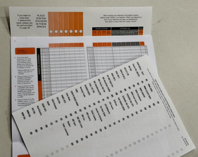
It turns out that they also did the radio research fieldwork. I asked a few questions, and idly said that I’d not seen an Australian radio diary, though I had seen one from the UK’s RAJAR, and I’d love to have one to look at. “Oh, I’ll go and get you one,” they said, and two minutes later, I had this in my hand. Not to fill in - just to look at.
I’m told that the real problem is finding people who don’t listen to the radio at all who are happy to fill out this diary, since they (understandably) think it’s a bit of a waste of time.
Now - you’d ordinarily be helped through how to enter this by the researcher; but I’m not filling it out, so I didn’t get the full demo. But, on the front of the diary, there is some “how to fill out” information, including a link going to this website, which has this video in it:
You might wonder: “a paper diary? How quaint!” But there are plenty of people who don’t have full access to the internet, and also for this sort of thing, a paper diary is actually rather more convenient for those filling it in. 80% of the diaries used are electronic, online diaries; so only 20% are paper these days. Diaries are used alongside streaming data and a watch that listens to the same things you do.
The diary is similar to the RAJAR one in the UK, and has a sticker sheet to mark the radio stations you listen to. You stick those into the flap at the top, and then mark the time (and platform) that you listened to those stations.
The diary starts on a Friday, and ends on a Saturday (so there are two Fridays and Saturdays in the diary). The demo video shows someone starting on a Sunday and finishing on a Saturday. I dimly remember that, in the UK, Monday has significantly more listening than Friday, and you’d assume part of that is related to fatigue in entering the data. (RAJAR always starts on a Monday).
Getting the right stickers at the start of the week is probably important, since if a sticker isn’t there, a listener can’t tick your station (or might forget about it). The sticker sheet is the important thing. In Australia, as in the UK I think, the researcher who’s come to your house will help you find the first few stations to put in your diary.
The sticker sheet is interestingly different from the way the UK does it.
First, the UK’s list of radio stations have a short description printed in the diary (which is supplied by the radio station itself). The diary would say something like: “Absolute Radio - the home of Dave Berry at breakfast and your no repeat workday”. Anything to remind the audience which station they actually listen to. In Australia, it’s just the station name - and a truncated one at that. It’s all about the station name: not the people on it. No surprise, then, that a simple station name (and no change to the personalities or the programming) can mean a significant change to its ratings.
Second, in the UK, radio stations are in a random order. That gets rid of the donkey vote of people just taking the first seven stickers - or the first stickers they recognise. In Australia, that’s not the case: stations are in a set order - commercial AMs, commercial FMs, ABC Radio, then commercial digital stations, and finally ABC digital stations. It could be argued that the stations towards the end of the list could do significantly worse than those at the top (and I’m sure it’s no coincidence that the ABC is the bottom of the list, not the top). Brands are separated, too (Triple J is miles away from Triple J Unearthed; NOVA separated from NOVA Throwbacks). It could be argued that randomisation might make it harder to find a station, and that might be a valid argument; though of course to put them in alphabetical order would put the ABC at the top…
Third, no community radio at all. Now, you can write the name of any station you like onto a spare sticker; that’s absolutely fine. But those stations aren’t prompted: if you listen to 4ZZZ a lot, you need to remember that, rather than be just given 4ZZZ as a listed station. I’m surprised by this; I was told that these figures measure community radio but don’t report on those numbers publicly; but actually, they wouldn’t measure community radio on a level playing field.
The survey itself lists quarter-hours where you mark the station you listen to, then where you listen (home, car, work, elsewhere), then the platform (AM/FM, DAB+, PH/TAB, PC/LAPTOP, SMT/SPK, OTHER) and finally a tickbox for if you used headphones. I’m assuming that the headphone question is to help normalise the watch data, which is not able to hear radio stations on headphones.
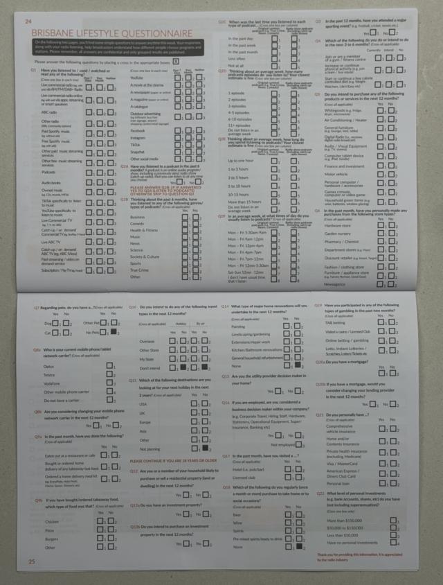
At the end of the survey is a “lifestyle questionnaire”, and it’s this that gives the useful information to advertisers, etc, that we don’t get to see from the public data. If I want to, and I have access to the data, I can advertise on radio stations that are listened-most by beer drinkers, or people wanting a European holiday, or podcast listeners, or people who want to buy an air conditioner in the next twelve months.
But this is all so old-fashioned!
Whenever I mention how radio is measured, people both inside and outside the industry scoff. “The diary system has to be the most antiquated thing of all time,” they say. “In a world of measurement… seriously. Stickers!!” Indeed, one radio person said exactly that, when I excitedly texted them a picture of my very own GfK diary.
When I’m made king - and it’s surely only a matter of time now - I would make it a rule to handcuff anyone making criticism like this, and only let them free when they’ve told us how they’d do it better.
In Australia, these diaries are used in five metro markets, as part of measurement dubbed Radio 360°. For these, 50,000 surveys are completed every year (so that’s roughly 10,000 per market). There are four fresh surveys every year (eight surveys in total which include parts of the previous survey), so you can then suspect that around 2,500 people per market are contributing to each released survey.
Radio 360° also includes streaming (“over millions of connected devices”) using data from streaming server logs. The downside of this data is that just by listening to a radio station online, you don’t know if I’m a boy or a girl, if I drink beer, or if I want a European holiday or an air conditioner. A “lifestyle survey” of the type in the back of the paper diary is an important part - and streaming logs just don’t give us this information. However, streaming logs absolutely give us consumption information - for those that listen to radio online. 82% of radio listening in Australia is not online. And, I’d lay a bet that an online radio listener is a different demographic to a listener to AM.
Australia has some electronic measurement - a total of 2,000 watches. In this case, that means 400 watches in each city; and watch-wearers keep their watches for longer (either 3 or 6 months). Apart from the cost of the equipment, GfK also have to pay people to keep the watch on - the rewards structure suggests that someone just in the scheme for three months should earn 10,900 points - enough for AUD $100 of store vouchers. Electronic measurement like this is expensive, and the data from the watches isn’t actually fed into the full survey data at the moment (but acts as a very useful check and balance).
Some markets in the US and Canada, and in Scandinavia, only use portable people meters - the equivalent to watches here in Australia. (The Swiss also use watches as radio measurement, because of course they do.) In Scandinavia, those portable people meters are measuring both radio and TV consumption, which is helpful to keep costs down for the media companies being measured.
Electronic listening data - like watches - sounds great. But it comes with much, much higher cost; misses all headphone listening, and the type of people who wear watches are not “everyone” - academic research says people who wear watches are more introverted, more conscientous and more punctual than those who don’t. And, watches record something different than a diary - they record exposure to radio listening, not actual recalled radio listening. Three minutes of B105 while you filled your car up with fuel at a servo doesn’t mean you’re a B105 listener; just that it was coming out of a speaker when you filled up.
After all of this - when you look at the Australian numbers, they’re remarkably stable. If the measurement was just nonsense, it would not look as consistent as it does.
Another industry veteran adds: “Of course, whichever ways it’s done, it doesn’t really tell us whether people are actually listening to the ads. Or to the other content.” That’s kind of true - though there are plenty of companies measuring the effectiveness of radio advertising, and advertisers wouldn’t return if radio advertising didn’t work for them. Additionally, we can measure, for example, the volume control on an app and directly correlate that to attention given. Here’s a company doing just that (and a radio station, too) - using streaming data, including volume control data, to work out what works and what doesn’t for the radio. But, once more, streaming data doesn’t measure everyone.
Here’s how to measure radio
Radio is on so many different platforms, it’s very difficult to measure.
But one really good way, it seems to me, is just to ask people. Ask enough people (enough different types of people) what radio stations they listen to and when; and weight the answers to reflect the population as a whole. A good way of doing that is to visit people in their homes and offices, and perhaps give them something to note down when they listen.
Bolster this information with data from online streaming if you have it. And use watches, or another device that listens to what you are listening to, to also give additional data to help.
And then make sure the data is consistent and that trends seem to make sense.
Which is… exactly how it’s done right now. Including this paper diary, above.