My experiment with a hyper-local website

Until I was chatting with someone today, I’d kind of forgotten about my brief time running a local website. I punched it up in the Web Archive, and I was quite pleased at what I saw, to be honest.
N14 is quite a small postal area in North London, centered around Southgate, where I used to live, with 11,000 households and 30,000 people. There was a website for the neighbouring N21, and another for N13, but we’d not got one.
In October 2013, I was mainly working from home and looking after a one year-old: and, when you’re a new parent, suddenly local life is your life, as you take a pram then a push-chair around the local streets, and learn quickly which local businesses are child friendly and which are not. Indeed, many of the walking paths on Google Maps are ones I drew, back before Google turned that feature off after people started realising that you could just draw penises on the map instead.
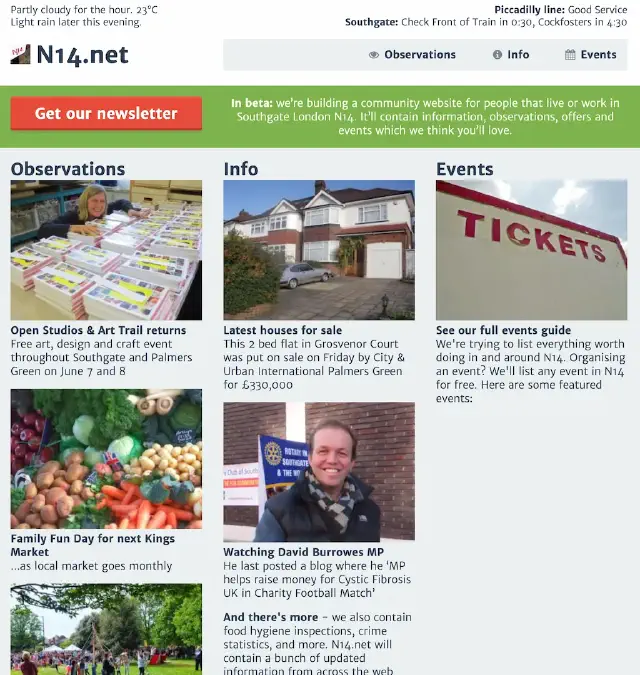
The header includes much of my thought about how the website would work. It included the weather forecast (which updated every minute, I seem to remember, with accurate rain warnings); and the local London Underground station, with whether the tube was running and what train was next. The archive snapshot appears to have caught it with “Check Front of Train” as the destination for the southbound! This data appears to be dynamically updated as you read using a little bit of “ajax”, which makes me feel old because nobody says “ajax” any more. (It strikes me that you could use that every-sixty-seconds call to measure dwell time; I’m surprised that I didn’t.)
It was split into editorial on the left, the “info” column was all data feeds, and then there was an events directory which was mostly empty. The editorial had no dates on the front page, because then you’d not know how sparsely updated it was.
Data feeds
It turns out that a postcode-related website does really very well in terms of data: there was quite a bit available. I had data feeds from an estate agent showing houses for sale (and I think, houses sold); a data feed from the Food Standards Agency about food hygiene ratings for each of the restaurants and takeaways in the area (which was surprisingly variable); a feed from the Metropolitan Police about crime in the area; and a page keeping an eye on our local MP, David Burrowes - grabbing data from “they work for you” and his own website.
The data aspect of the website was quite helpful: and I’m sure that were I to be running something similar today, there would be plenty more data feeds to incorporate. I think there’s still something in this (and why there’s a fair amount of data feeds within Podnews and the Podcast Business Journal).
Positivity
In the about us page, I said I’d run it for a year to see how it went. It also says “We use the phrase ‘observations’ on our site, because we’re not here to do ’news’”, and “The only agenda we have is a positive feeling for the place where we live.” Indeed, I remember covering the closure of a pub by saying “new turkish restaurant to open” rather than “hundred year-old pub closes”: putting the positive spin on as many stories as I could.
The closure statement is a bit cringey reading it now, but gives the final numbers for the website: “13,202 people contributed to over 17,000 visits to the website. We saw 29,828 pageviews. We have 156 people wanting our newsletter.”
Looking at the code, this was my own code (because of course it was); but I used a CSS framework called TukTuk. It looks as if it’s stood the test of time. The site was nicely responsive and nice and fast. I quite like the header, even now. One thing I particularly liked was the code I had to programmatically all of the “page credits” into one place at the bottom of the page.
I wonder if there are any learnings for websites today? I’d like to think there are. Fun to look back at it.
I now live in a similarly small postcode area - but it’s a third as large, with just 10,000 people living here, and just 3,770 households. I doubt it’s a business opportunity.