Trip report: Finnair's curious (and welcome) lack of choice

I’m in the middle of a slightly strange round-the-world trip: going from Brisbane to London, then Orlando, then Toronto, followed by back home. The downside of Australia is that it’s a long way away: and often, circumnavigating the globe is the thing you need to do, rather than come back the way you came.
That is one of the reasons why I found myself in a Finnair plane last week. It works out cheaper to fly long-haul into Helsinki airport with Finnair, rather than into London Heathrow with Qantas or British Airways, especially if you’re taking another plane later over to the US.
Finnair’s planes are spacious and decent: an Airbus A350-900, with a lot of bespoke work for Finnair. As a Qantas Platinum, I was well looked-after, with a comfortable economy seat in the part reserved for Platinums - lots of leg room, and on this flight, I was the only person in a row of three seats, giving me plenty of opportunity to lie down for part of the 13h 20m flight.
There are a few differences from flying with Qantas apart from the nice new plane. Instead of the lengthy, noisy and quite tiring Qantas flight safety video, which is more travel documentary than a piece of communication, Finnair has a very simple, matter-of-fact, video with the bare minimum to explain. It wouldn’t surprise me if the internal brief was: “make this as short as you can”. They succeeded if so.
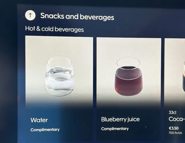
Second, Finnair’s corporate colour is a cold blue. Impressively, they’ve managed to program the lights to wake you up using an approximation of the northern lights - cycling through the blues and greens in an apparently random, and entirely unobtrusive, way. It’s a great piece of branding (alongside the copious amounts of snow in the videos). The blue extends to the juices available on-board: a choice of apple or… blueberry.
The in-flight systems (which are powered by a bespoke Android app, I noticed, after the inevitable reboot) are fast, responsive, and have genuinely useful things in them, including a decent flight map and the day’s in-flight menu (and details of the decent and cheap in-flight wifi).
The menu is there for information, though, not to help you choose. Because there is no choice.
No choice
With Qantas, you get the choice of beef that looks suspiciously like dog food, a chicken curry, and some disappointing green things as a vegetarian option. What tends to happen is that the FAs walk through the cabin, saying “you can choose from chicken, green things or dog food” to every single row of passengers. I try to get in quick with “CHICKEN PLEASE OBVIOUSLY” to save everyone some time.
But, that’s not the case on Finnair. Dinner was chicken and rice. That’s the meal. Chicken and rice.
With Qantas, before everyone else gets their meal, if you’ve chosen a special meal, there’s a scamper of excited FAs walking up and down the cabin hand-delivering these meals before everyone else gets their food. It means you’ve probably finished the meal before the drinks come round; and your empty tray will be in front of you for around 45 minutes after you’ve finished. It’s inefficient, and a bit rubbish.
With Finnair, you can pre-order a vegetarian or other meal: and that gets given to you during the main meal service. Everything happens at the same time: and there’s no palaver with finding you early to give you the meal and singling you out as the person that wanted the bland meal. It’s all good.
And with Finnair, that means that because there’s only one choice, there’s no disappointed people towards the back, who get the choice of what everyone else has declined (“we’ve only got the dog food left”); and no waste. It’s quicker, more efficient, better for the environment, and nobody misses out.
Who’d have thought that a lack of choice was a better option?