Review: Onyx Boox Tab Mini C
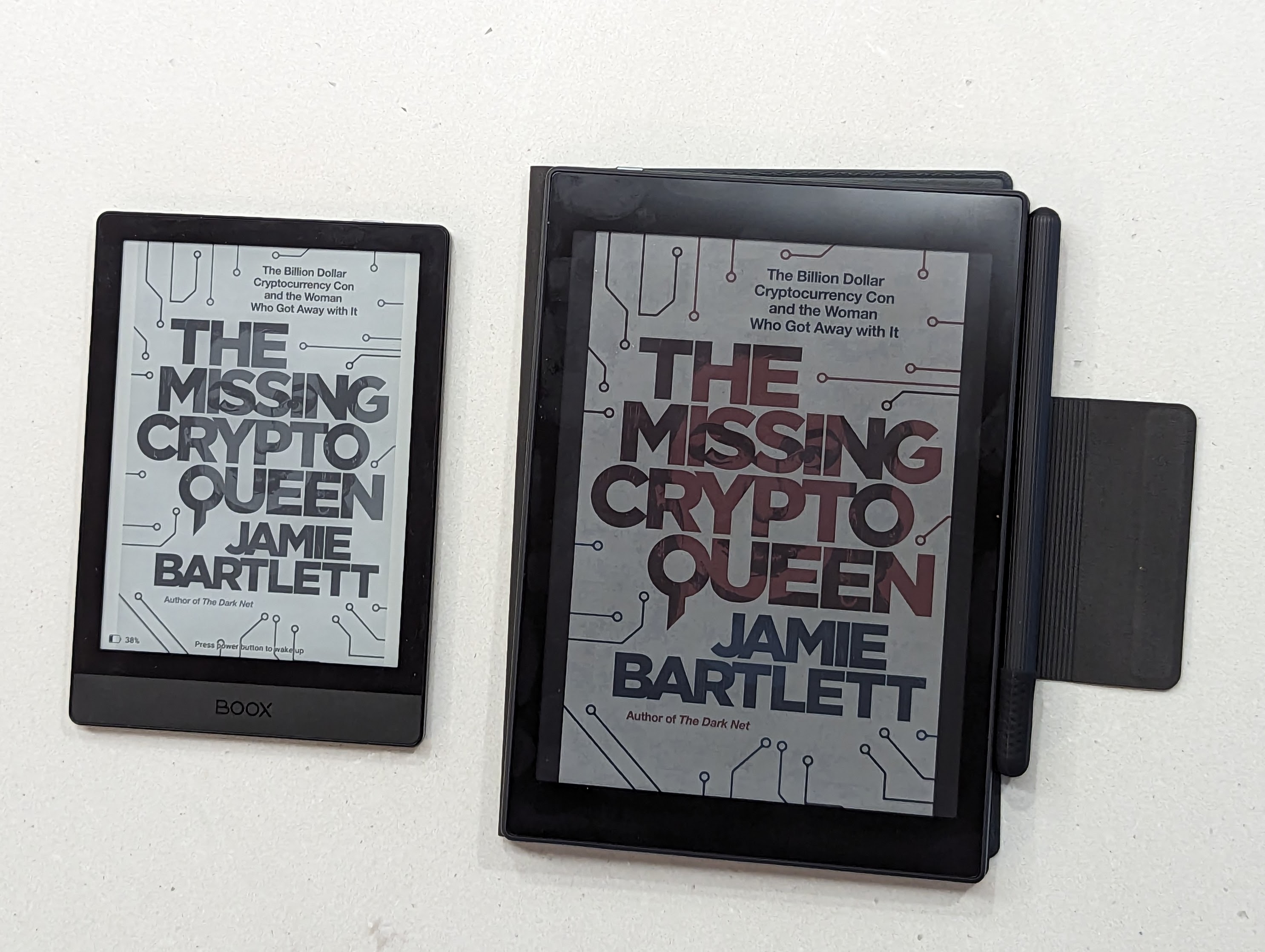
I have a little Onyx Boox Poke 3 ebook reader, above left. It’s small, made of plastic and glass, very light, with a lovely clear eInk screen.
It’s a splendid thing, and the only real complaint I have with it is that it is a little small for reading anything other than ebooks on. A magazine, for example, is really difficult to read on the small 6" screen. I moved down from a 7" Kobo.
So, late one night, I read an effusive review of an Onyx Boox Tab Mini C. It has a 7.8" eInk screen, and it also has a pen for notes, and a colour screen. And I thought - great, this is the thing for me.
And I was wrong.
Build quality
It arrived quite quickly. I ordered it from Hong Kong, and it got to Australia in about a week. (The confirmation emails went to spam, which might useful for others to know).
Because I ordered it from Boox directly, it came with a free case. It’s magnetic, holds the pen securely, and automatically puts the device in stand by when you close the cover.
It is also a horrible cheap plastic. The pen holder thing gets in the way when you open it. The folding cover has a hinge that is rather flexible, which means that when you open it, it can easily not be “in line” with the back. The cover has sharp heat-moulded edges which makes holding the device quite uncomfortable. And (and this is obvious), it covers the screen (good) so the screensaver - which I set to be whatever book I’m reading - can’t be seen (bad). It’s a decidedly unpremium thing.
The pen comes with a comically cheap squishy lid, which you are guaranteed to lose within five minutes of getting the thing. The pen itself is nicer, feels sturdy, has a flat side to it that stops it from rolling away and contains a magnet to attach it to the side of the tablet. There are no spare nibs in the case, or anything to tell you what type of pen it is. I can tell you that it doesn’t work with an Apple pencil.
The Tab Mini C itself is nicely built, with an almost all-metal case and a black glass front. The power button is top-left rather than top-right, but I’ll get used to it.
It is really very, very heavy though: at 310g it’s more than twice the weight of the 150g Poke 3. It’s also 15g heavier than the iPad Mini 6 that I own.
Software
The notes app is nice. The pen works well in it. There is no appreciable lag and it is pressure sensitive and everything.
It’s nice to see that Google Play store integration is properly implemented, and doesn’t require a hack to get it enabled. That wasn’t the case with the Poke 3.
The Android build that the device uses is still, to be kind, garbage. It ships with the standard Android OEM keyboard, but by default, you get some kind of Onyx special keyboard which I can only guess is really for Chinese typists, since it doesn’t follow half of the norms of a typical keyboard you’d use otherwise - not least, a large “enter” button to take you out of punctuation mode. You can turn it off though.
As one example, while this version of the OS has a seemingly-editable “Secure DNS” menu item in setup, you can click into it but it doesn’t make the keyboard appear, so you can’t edit it. (There’s an app to let you get into the proper Android settings app - it’s called “Open Hidden Settings”, and is in the Google Play store.)
And then, there’s the screen.
The Screen
What I love about the Poke 3 is the high-contrast eInk screen. It’s really nice and sharp; and in any natural light you can turn off the front light on the device entirely. It’s great. But that isn’t an eInk thing, it’s an eInk Carta Plus screen that gives you that.
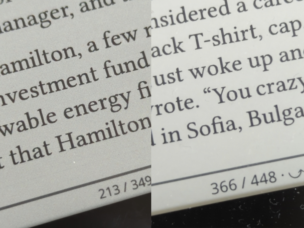
The Tab Mini C uses a colour e-ink Kaleido 3 screen, with a slightly confusing mention in the specs about resolution - black text is 300 dpi, but colour is 150 dpi. The black text should be the same crispness as the Poke 3, from those specs - but it is not - it might be the same resolution, but the screen doesn’t look anywhere near as sharp.
The colour is muted and dull, but I was expecting that. What I wasn’t expecting is that the whole screen is covered in little black dots - part of the colour filter overlay, but it has the effect of making the whole screen look extraordinarily dull and dark.
It is almost entirely unusable without the front light on (and on quite high).
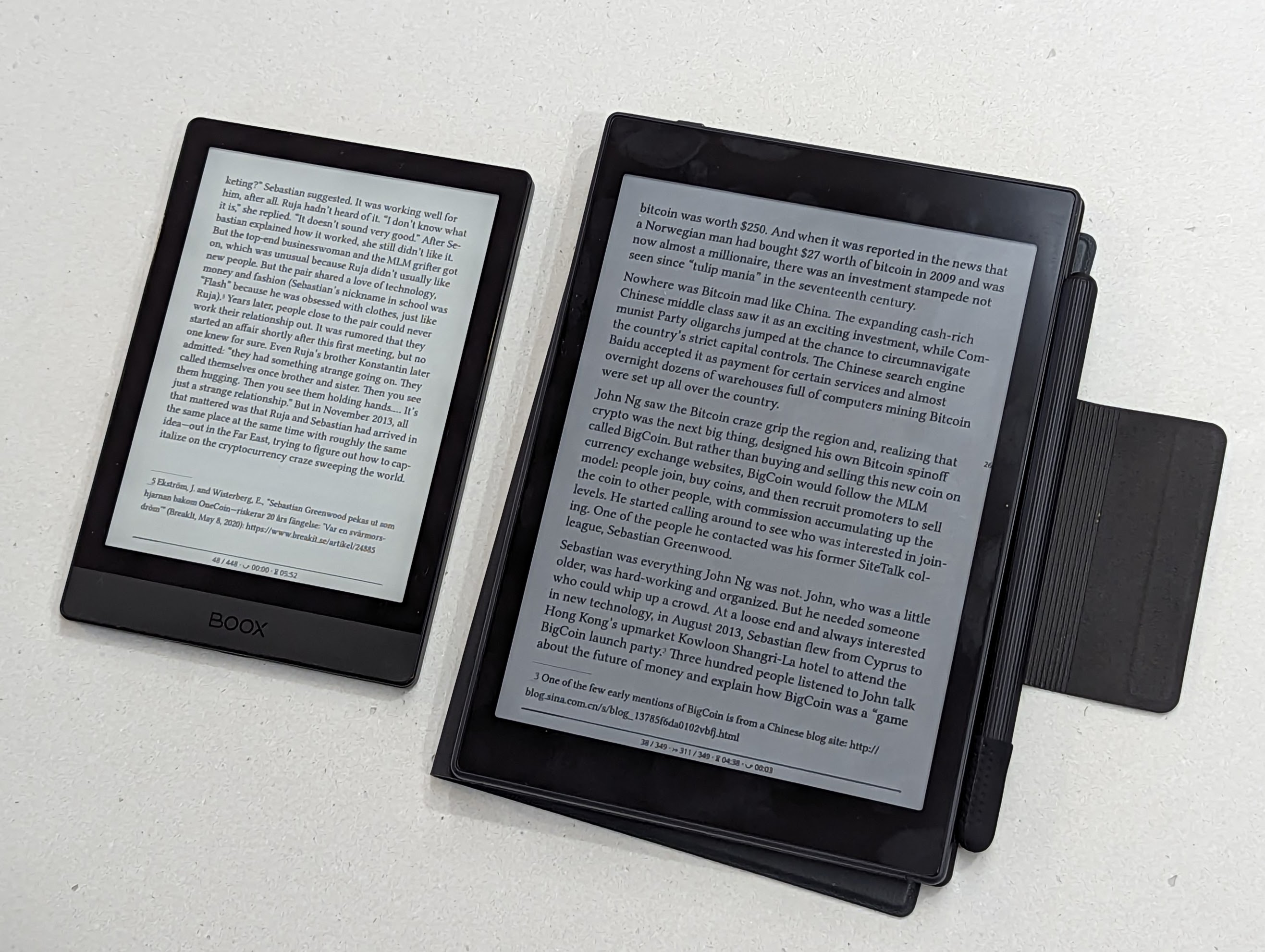
It’s quite hard to show this, since my phone’s camera does a good job of making most things visible and clear. But, above, you can see a typical book reading experience, in my well-lit kitchen. The little Poke 3 shows up as having a nice very light grey screen, but the Tab Mini isn’t the same - a dark screen that really isn’t very visible, unless you fire up the lighting system.
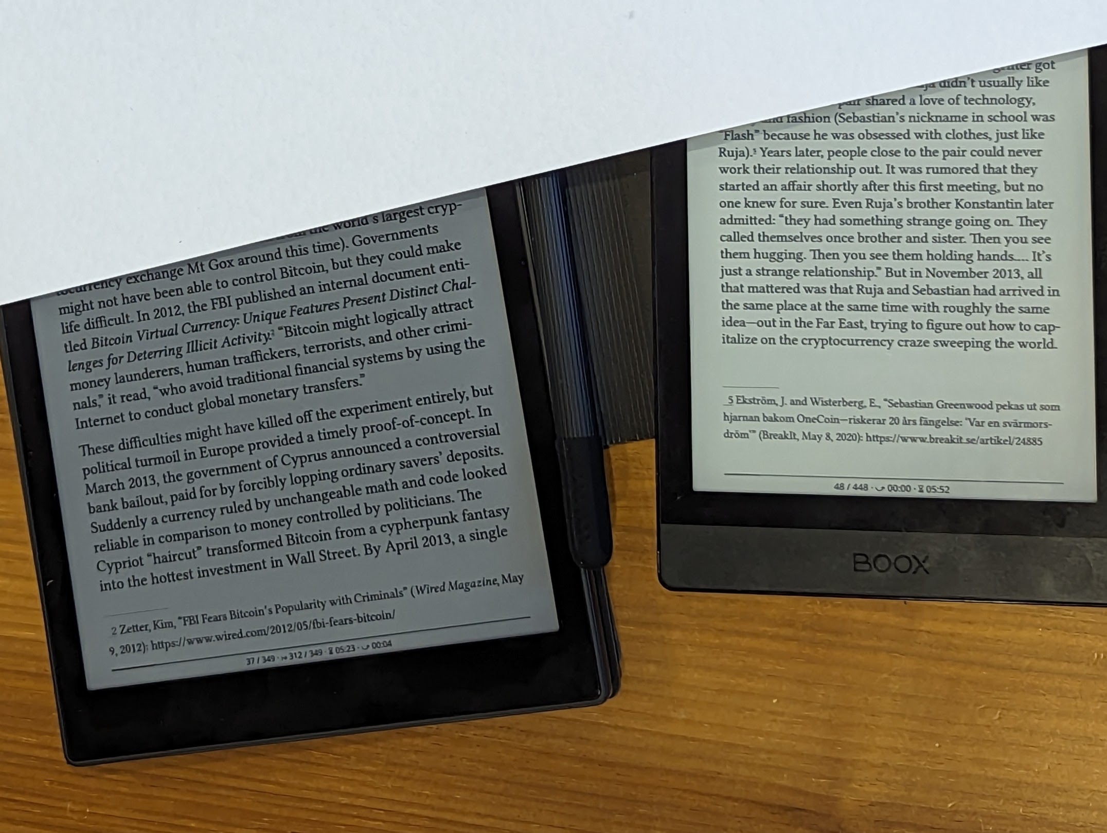
Above, a closer look, with a piece of A4 paper placed over the two. Again the phone’s camera has done some post-processing, but it should be relatively clear that the Tab Mini C has a much darker screen.
And again, above, the little black dots are rather visible to me (Tab Mini C on the left, the Poke 3 on the right).
This annoyance disappears somewhat when you fire up the frontlight on the Tab Mini C. But only somewhat. Those visible dots are still there, however you look at this device; and a glowing screen turns it into an electronic device, rather than a piece of magical paper. I already have an electronic device - it’s an iPad, and if I want to stare at an artificial light to read a book, I’ll do it on that, please - it’s a much nicer screen without any black dots on it. Or, better, use the little, light, Poke 3.
Does the colour add to the experience?
Mmmph. The colour’s OK. The colour is half the resolution of the text; and it follows the diagonal pattern of the colour overlay, so there’s an odd effect on most images. It doesn’t cope well with most images, which are reduced to splodges of colour on the screen rather than anything detailed. Turning on the frontlight makes everything look pastel-coloured and washed-out - and highlights that this isn’t an iPad with its glorious, high-resolution 327dpi colour screen, but a 300dpi b/w screen with 150ppi colour images that have been painted in chalk.
And because it’s an eInk screen, it isn’t responsive at all - it isn’t capable of watching a video on for example, and even rudimentary animation confuses it enough to leave smears across the screen. It’s an experience with a lot of flashing-resets of the screen. It’s really not a good thing.
In conclusion
Ultimately, it fails in its primary purpose of being an eink reader, because the screen is so dark you have to turn the frontlight on in almost every environment. That, alone, makes it a mistaken purchase. It’s also simply too heavy as an ebook reader in my view.
It fails in its secondary purpose of being a decent tablet, because its screen isn’t capable of video or anything in motion; and barely manages to display colour photographs well. It’s running a two year-old version of Android, too.
For a great e-reading experience, grab a Poke 5. 160g, a decent high-contrast screen, and just $170. The 6" screen is just fine for reading books on. (I’d recommend KOReader as your reading app, as is shown in the above screenshots, with some nice font faces like Linux Libertine). For an e-reader, I’d recommend Boox over anything else - Android lets you run a wide variety of readers and apps, and Boox devices are well made and work well.
Or, for a great tablet experience - even though I’m normally Android on the phone - nothing surpasses an iPad Mini 6. It’s lighter, has a significantly better screen, is so much more capable of anything you throw at it, and at $449, the Tab Mini C is only $70 cheaper anyway.
You can’t be all things to all people: and this device proves it. I regret buying this thing.