First impressions - a quick review of an iPod Touch

I mentioned, over on Facebook, that I was getting most excited about the iPod Touch, and that I wanted to buy one. And I got two almost instant replies on my “wall”.
Andy, a man who’s unable to drink more than a pint of cider without running away, said: “I’d certainly appreciate a high quality Cridland review if you get the chance, very close to purchasing one myself.” And then, Trevor, a man who’s unable to write or talk without using language requiring strategically-positioned asterisks, added “What a sh*tting surprise.. James buying a gadget… HOLY T*TS! But I’m with Andy.. if it’s any good will you tell us.”
Well. I’ll give you a high-quality Cridland review in a bit. But here’s my ‘first impressions’ review. It’s very, very fine indeed. It’s thin - incredibly so - and a highly beautiful-looking device. And give that my phone, while O2, is under the cold grey hand of beaurocratic dullness, a new phone isn’t an option. So what was I waiting for?
The music player works well, and, to my cloth ears, sounds better than my previous Nano, though that might just be the embarrassment of spending so much money on a replacement for something which hadn’t broken yet. “Shuffle”, the way I always use my iPod, is quite easy to use, and the graphics are beautiful.
One of the downsides of the touchscreen is that it’s impossible to change the volume level without getting it out of your pocket, hitting the home button twice, and then fiddling with the screen. At least with my old trust Nano, I can feel for the volume control. If you’re wondering whether to get an iPhone or an iPod Touch, note that the volume control on the iPhone are buttons on the side.
But the touchscreen, and the user-interface that comes from it, is beautifully done. The “flick” works excellently; it’s quick and easy to find anything as a result. The whole UI is animated in such a way to make using it a joy. The ‘cover-flow’ is also a really usable way of exploring your music.
But naturally, you wouldn’t be interested if the only thing it did was play songs. Because that’s the least of this thing’s capabilities. It does video, too - things like CNET Live are crisp and clear on the screen (only playing in landscape format, incidentally). A double-tap smoothly switches between “fill the screen” and “see the whole picture”.
But if your own downloads aren’t quite enough, the YouTube application is astounding. Using the built-in wifi in the device, the video quality, to me, is impressively better than the same YouTube on the PC - probably because it uses H264 which’ll be supported in the next version of Flash.
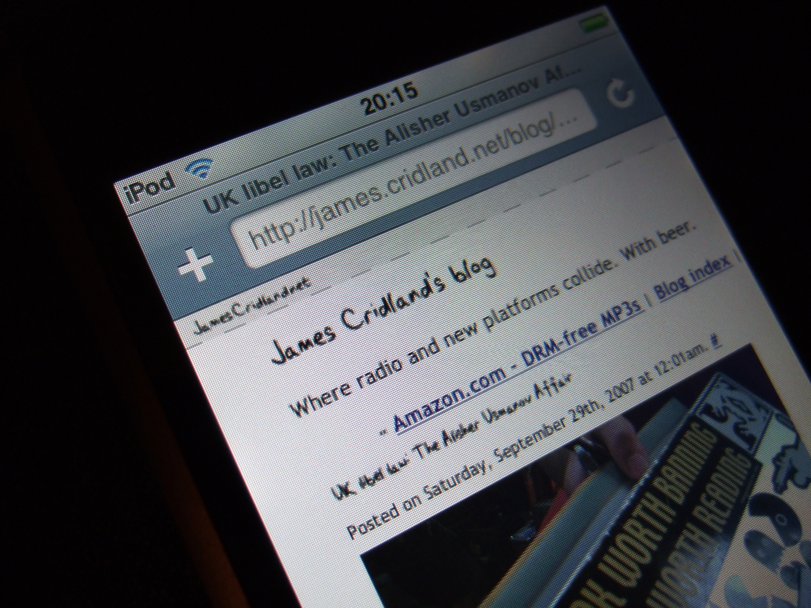
The wifi is also used for the in-built Safari. The test of any browser, for me, is whether it’ll cope with the complication of loading, say, Gmail. The good news is that it does. You can even read your email in the fully zoomed-out view. Most users, though, will find the special PDA version of Gmail rather more usable; you can get to it via http://www.google.com/ig/mobile, a useful page to know about, since it also gets you to the mobile version of Google Reader. But, it coped happily with anything I threw at it - the BBC News website works just fine, for example (as long as you don’t want to watch any of the video content).
The device is surprisingly high-powered, too. I loaded a complicated website, www.nyt.com, on both my copy of Firefox on the PC, and Safari on the iPhone; having ensured the cache was clear on both occasions. My “battery lasts half an hour” PC loaded the page in 12 seconds; the iPhone took a respectable 16 seconds. It should be noted that the page was visible and readable on both devices before it had fully loaded, so the wait-time was even lower.
This is a viable “take it into the garden and read the e-paper” device. The fact it’s an iPod is almost irrelevant.
The ‘contacts’ application, which syncs both ways (so you can add contacts on your device), is a good system - particularly when combined with Plaxo on my Mac, which means the changes I made on a boring tube journey are now part of my proper contacts book across the many devices I use.
Sadly, the ‘calendar’ application is less useful. Through no apparent reason other than a wish to cripple the device, Apple removed a chance of editing your calendar directly from the iPod; so it’s read-only. You -could-, I suppose, use Google Calendar through the wifi, and get iCal to sync that, but it’s a shame that this has been crippled in this way.
Connecting to wifi is quick, and the device is quite sensitive; it finds an amazing amount of wireless networks in central London, and connects almost instantly to my (hidden) WPA connection at home.
In conclusion, then, this is three devices in one. A surprisingly-usable web tablet. A splendidly capable contacts book. And it plays music (and video) too.
Add a phone in there and, well, you’ve really got something.
.
Looking for some tips and tricks?
- Make sure you use a powered USB hub, or plug it directly into your computer. Mine irritatingly made the “syncing” noise, but did nothing more, until I fiddled around. Just because your previous iPods charged happily on an unpowered hub doesn’t mean this new beauty will.
- Want a sensible case for it? An Apple iPod sock is just the ticket; it fits almost too perfectly.
- Developing for it? The user-agent contains “iPod” and not “iPhone”.